Twenty years of pollen levels in Eugene, OR
This is an analysis I did back in 2020. You can see the original notebook here.
The city of Eugene, Oregon, sits along the Willamette river downwind of the many grass seed farms. These farms comprise an industry estimated to be worth half a billion dollars and have given the Willamette Valley the reputation of “grass-seed capital of the world”. As a consequence, the inhabitants of Eugene and nearby cities suffer through a long and severe grass pollen allergy season every spring and summer. Combined with the tree pollen season that typically occurs early spring, the Eugene air during peak pollen counts contains over 1500 grains of pollen per cubic meter.
Pollen counting in Eugene is conducted by the Oregon Allergy Associates, which reports its daily results to the National Allergy Bureau (NAB). Data from several stations can be accessed on the American Academy of Allergy Asthma & Immunology (AAAAI) website, with daily counts for the Eugene station dating back to 2001. Pollen collection is performed by pulling air into a container where pollen and other airborne particulates stick to a microscope slide, and counting the amount of pollen on the slide every 24 hours. Since the raw counts are hard to interpret without context, they are converted to a scale based on typical allergic reactions:
| Grass Pollen Counts | Tree Pollen Counts | Pollen Level |
|---|---|---|
| N/A | N/A | no count |
| 0-4 | 0-14 | low |
| 5-19 | 15-89 | moderate |
| 20-199 | 90-499 | high |
| 200+ | 500+ | very high |
For this analysis this scale will be treated as a scale of 0-4 (0 = no count, 4 = very high) in pollen level.
Summary
- There are no long-term trends in the severity of pollen seasons over the twenty-year period.
- Tree pollen seasons can start anywhere between January and March, usually peaking in April and ending in May.
- Grass pollen seasons usually start during May, peak in June, and end during July.
- Pollen seasons that start early tend to last longer.
- Pollen seasons that last longer record more cumulative pollen, rather than spreading out the total pollen count.
- The severity of tree and grass pollen seasons are loosely correlated, suggesting that there may be a correlation between the start (and duration) of a tree pollen season and the subsequent start (and duration) of a grass pollen season.
Table of contents
- Imports and functions
- Load data
- Trends by pollen type
- Trends by pollen type
- High-pollen days
- Pollen season timing
- Season duration
- Season severity
- Correlation between pollen types
Imports and functions
Show code
import datetime
import numpy as np
import pandas as pd
import matplotlib.pyplot as plt
import matplotlib.dates as mdates
import matplotlib.patches as mpatches
import matplotlib.colors as mcolors
import matplotlib.lines as mlines
import statsmodels.api as sm
from statsmodels.stats.outliers_influence import summary_table

plt.style.use('seaborn')
Some parameters for plotting and labeling
Show code
cols = ['trees', 'weeds', 'grass']
col_labels = {'trees': 'Tree pollen', 'weeds': 'Weed pollen', 'grass': 'Grass pollen'}
months = ['Jan', 'Feb', 'Mar', 'Apr', 'May', 'Jun', 'Jul', 'Aug', 'Sep', 'Oct', 'Nov', 'Dec']
monthdays = [31, 28, 31, 30, 31, 30, 31, 31, 30, 31, 30, 31]
monthstartdays = np.cumsum([0] + monthdays[:-1]) + 1
pollen_levels = ['no count', 'low', 'moderate', 'high', 'very high']
Smoothing functions
Show code
def padded_array(x, pad):
    return np.concatenate((np.ones(pad) * x[0], x, np.ones(pad) * x[-1]))

def smooth(x, kernel, w, pad):
    kernel /= kernel.sum()
    x_smooth = np.convolve(x, kernel, mode='same')
    std = np.sqrt(np.convolve((x - x_smooth)**2, kernel, mode='same'))
    if pad > 0:
        x_smooth = x_smooth[pad:-pad]
    if pad > 0:
        std = std[pad:-pad]
    return x_smooth, std

def boxsmooth(x, w=1, pad=0):
    x_padded = padded_array(x, pad)
    kernel = np.ones(w) / w
    return smooth(x_padded, kernel, w, pad)

def gsmooth(x, w=1, pad=0, kernel_threshold=1e-5):
    x_padded = padded_array(x, pad)
    kernel_x = np.linspace(-x.size, x.size, x_padded.size)
    sigma = w / (2 * np.sqrt(2 * np.log(2)))
    kernel = np.exp(-kernel_x**2 / (2 * sigma**2))
    kernel[kernel < kernel_threshold] = 0
    return smooth(x_padded, kernel, w, pad)
Least squares fit with prediction bands
Show code
def linear_fit(x, y):
    X = sm.add_constant(x)
    res = sm.OLS(y, X).fit()

    _, data, _  = summary_table(res, alpha=0.05)
    yfit = data[:, 2]
    ci_low, ci_upp = data[:,4:6].T
    return yfit, ci_low, ci_upp
Load data
Show code
df = pd.read_csv('data/eug-or.csv', index_col=0)
df.index = pd.to_datetime(df.index)
df = df[~((df.index.month == 2) & (df.index.day > 28))]
All 19 years of pollen counts
Smoothing over the data provides a clearer picture of the yearly pollen season. Grass pollen is reported in the highest quantities every year, followed by tree pollen. Weed pollen makes a rather negligible contribution. Apart from the annual peaks no larger-scale trends are apparent in any of the pollen types.
Show code
fig, ax = plt.subplots(3, 1, figsize=(20, 15))
fig.suptitle("Pollen levels in Eugene, OR (2001-2020)", y=0.95, fontsize=30)
for i, col in enumerate(cols):
    values = df[col]
    values_smooth, _ = gsmooth(df[col].values, w=20)
    x = (df.index - df.index[0]).days
    ax[i].plot(x, values, '.')
    ax[i].plot(x, values_smooth, '-')
    ax[i].tick_params(labelsize=14)
    ax[i].set_xticks(range(x[0], x[-1], 365))
    ax[i].set_xticklabels(range(2001, 2022))
    ax[i].set_yticks(range(len(pollen_levels)))
    ax[i].set_yticklabels(pollen_levels)
    ax[i].set_title(col_labels[col], y=0.95, bbox=dict(boxstyle='round', facecolor='w'), size=20)
    ax[i].set_ylim(-0.1, 4.5)
    ax[i].grid(True)
fig.savefig('plots/eug-or-full.png')
plt.show()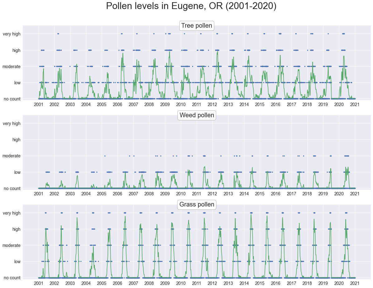
Monthly averages over 19 years
Grouping the data by month for each pollen type reveals an annual pattern: tree pollen peaks in the early spring, while weed and grass pollen peak in the early summer.
Show code
pv = pd.pivot_table(df, index=df.index.month, columns=df.index.year, values=cols, aggfunc='mean')
fig, ax = plt.subplots(len(cols), 1, figsize=(15, 15))
fig.suptitle("Monthy average pollen levels for Eugene, OR (2001-2020)", y=0.95, fontsize=30)
for i, col in enumerate(cols):
    years = pv[col].columns
    for j, year in enumerate(years):
        alpha = j / len(years)
        ax[i].plot(range(1, 13), pv[col][year].values, 'o', markersize=8, markerfacecolor='none', markeredgecolor='b', alpha=alpha, label=year)
    for k in range(1, 13):
        ax[i].boxplot(pv[col].loc[k], sym='', positions=[k], widths=0.5)
    ax[i].set_title(col_labels[col], y=0.95, bbox=dict(boxstyle='round', facecolor='w'), size=20)
    ax[i].tick_params(labelsize=14)
    ax[i].set_xticks(range(1, 13))
    ax[i].set_xticklabels(months)
    ax[i].set_yticks(range(len(pollen_levels)))
    ax[i].set_yticklabels(pollen_levels)
    ax[i].set_ylim(-0.1, 4.5)
    if i == 0:
        ax[i].legend(bbox_to_anchor=(1, 1), fontsize=20)
    ax[i].grid(True)
fig.savefig('plots/eug-or-monthly.png')
fig.show()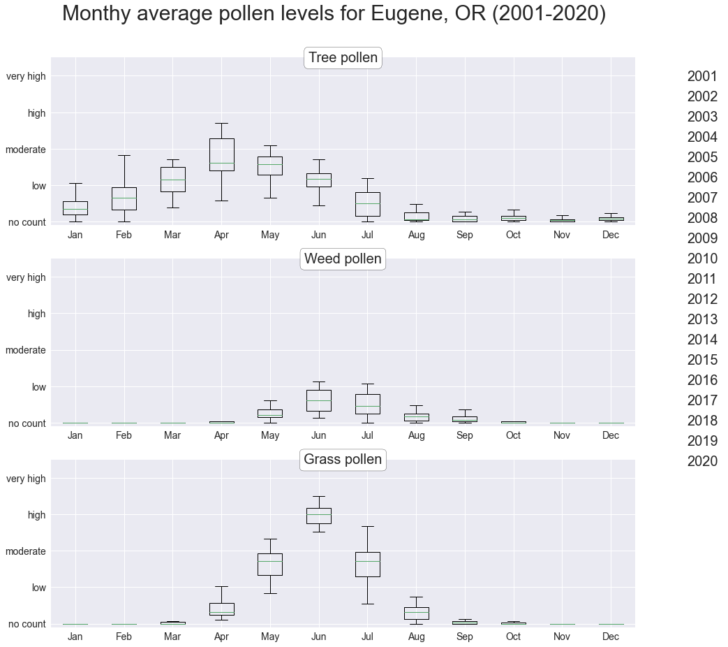
Daily averages over 19 years
A prettier visualization of basically the same trends as above.
Show code
pv = pd.pivot_table(df, index=df.index.dayofyear, columns=df.index.year, values=cols, aggfunc='mean')
w = 30
pad = w
fig, ax = plt.subplots(1, 1, figsize=(20, 6))
means = []
lgd_patches = []
lgd_labels = []
for col in cols:
    days = pv.index
    mean = pv[col].mean(axis=1)
    means.append(mean)
    std = np.std(pv[col], axis=1)
    lower_bound = mean - std
    upper_bound = mean + std
    line, = ax.plot([], [])
    color = line.get_color()
    lgd_patches.append(mpatches.Patch(facecolor=color))
    label = col_labels[col] #col[0].upper() + col[1:]
    lgd_labels.append(label)
    ax.plot(days, mean.values, '.', color=color)
    ax.fill_between(x=days, y1=lower_bound, y2=upper_bound, color=color, alpha=0.2)
    mean_boxsmooth, std_boxsmooth = boxsmooth(mean.values, w=w, pad=pad)
    mean_gsmooth, std_gsmooth = gsmooth(mean.values, w=w, pad=pad)
    lower_bound = mean_gsmooth - std_gsmooth
    upper_bound = mean_gsmooth + std_gsmooth
#     ax.plot(days, mean_boxsmooth, '--', lw=3, color=color)
    ax.plot(days, mean_gsmooth, lw=3, color=color)
    ax.fill_between(x=days, y1=lower_bound, y2=upper_bound, color=color, alpha=0.3)
ax.set_title('Daily average pollen levels in Eugene, OR (2001-2019)', size=24)
ax.tick_params(labelsize=18)
ax.set_xticks(monthstartdays)
ax.set_xticklabels(months, ha='left')
ax.set_yticks(range(5))
ax.set_yticklabels(['no count', 'low', 'moderate', 'high', 'very high'])
ax.set_xlim(-1, 368)
ax.set_ylim(0, 4)
ax.legend(lgd_patches, lgd_labels, bbox_to_anchor=(1, 1), fontsize=18)
text_str = "Dots represent daily average across all years.\nLines are the same averages with smoothing applied."
text_bbox = dict(boxstyle='round', facecolor='w')
ax.text(190, 3.85, text_str, va='top', bbox=text_bbox, size=12)
ax.grid()
fig.savefig('plots/eug-or-daily.png')
fig.show()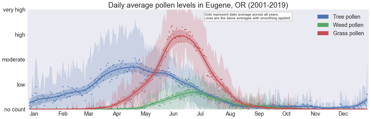
Trends by pollen type
There are no obvious long-term trends in the annual average pollen counts.
Show code
pv = pd.pivot_table(df, index=df.index.month, columns=df.index.year, values=cols, aggfunc='mean')
fig, ax = plt.subplots(1, 1, figsize=(15, 6))
for i, col in enumerate(cols):
    ax.plot(pv[col].mean(0), label=col_labels[col])
    ax.tick_params(labelsize=14)
    ax.set_xticks(years)
    ax.set_yticks(range(len(pollen_levels)))
    ax.set_yticklabels(pollen_levels)
    ax.set_ylim(-0.1, 4.5)
    ax.grid(True)
    ax.legend(bbox_to_anchor=(1, 1), fontsize=20)
plt.show()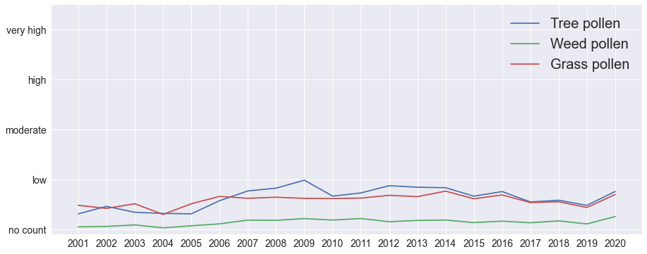
Trends by pollen type and month
Grouping the data by month doesn’t reveal any interesting trends either.
Show code
pv = pd.pivot_table(df, index=df.index.month, columns=df.index.year, values=cols, aggfunc='mean')
fig, ax = plt.subplots(len(cols), 1, figsize=(15, 15))
for i, col in enumerate(cols):
    years = pv[col].columns
    for j, month in enumerate(months):
        ax[i].plot(years, pv[col].loc[j + 1], label=month)
    ax[i].tick_params(labelsize=14)
    ax[i].set_xticks(years)
    ax[i].set_yticks(range(len(pollen_levels)))
    ax[i].set_yticklabels(pollen_levels)
    ax[i].set_title(col_labels[col], y=0.95, bbox=dict(boxstyle='round', facecolor='w'), size=20)
    ax[i].set_ylim(-0.1, 4.5)
    ax[i].grid(True)
ax[1].legend(bbox_to_anchor=(1, 1), fontsize=20)
plt.show()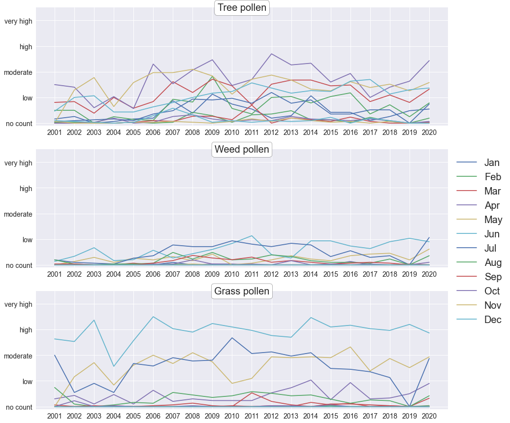
High-pollen days
This is a rather uninformative way of showing the number of high-pollen days per year.
Show code
fig, ax = plt.subplots(len(cols), 1, figsize=(15, 15))
fig.suptitle("Pollen level trends by year for Eugene, OR (2001-2020)", y=0.95, fontsize=30)
years = np.unique(df.index.year)
cmap = plt.cm.jet
for i, col in enumerate(cols):
    for year in years:
        series = df[col][df.index.year == year]
        x = series.index.dayofyear
        highs = np.sum(series > 2)
        y, yerr = gsmooth(series.values , w=10, pad=0)
        ax[i].plot(x, y, color=cmap(min(1, highs / 50)))
    ax[i].set_title(col_labels[col], y=0.95, bbox=dict(boxstyle='round', facecolor='w'), size=20)
    ax[i].tick_params(labelsize=14)
    ax[i].set_xticks(monthstartdays)
    ax[i].set_xticklabels(months, ha='left')
    ax[i].set_yticks(range(len(pollen_levels)))
    ax[i].set_yticklabels(pollen_levels)
    ax[i].set_xlim(-1, 365)
    ax[i].set_ylim(-0.1, 4.5)
    if i == 0:
        lines = [
            mlines.Line2D([0], [0], color=cmap(1.0), lw=4),
            mlines.Line2D([0], [0], color=cmap(0.5), lw=4),
            mlines.Line2D([0], [0], color=cmap(0.0), lw=4)
        ]
        ax[i].legend(lines, ['>50 high-pollen days',  '25 high-pollen days', '0 high-pollen days'], bbox_to_anchor=(1, 1), fontsize=20)
    ax[i].grid(True)
# fig.savefig('plots/eug-or-monthly.png')
fig.show()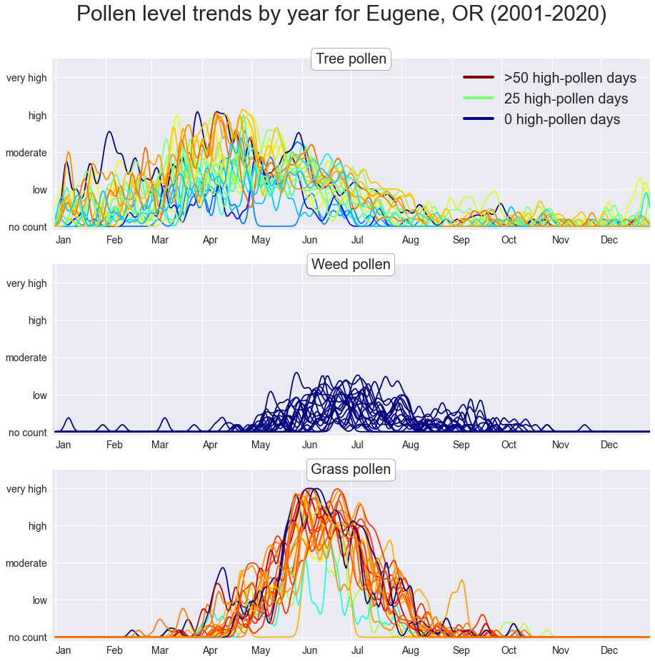
Pollen season timing
We can define the “start” and “end” of a pollen season by the dates of the first and last “high” or “very high” pollen counts. There are no obvious correlations between the start and end dates. Interestingly, though, the start dates of tree pollen seasons are spread across a period of over two months (starting anywhere between January and mid-March), whereas the end dates often fall within the month of May. This suggests that tree pollen seasons can vary quite widely in duration. This is more apparent in the next few plots.
Show code
fig, ax = plt.subplots(1, 2, figsize=(17, 6))
fig.suptitle("Start and end dates of pollen seasons", y=1.05, fontsize=25)
years = np.unique(df.index.year)
label_years = [2001, 2010, 2020]
cmap = plt.cm.jet
for i, col in enumerate(['trees', 'grass']):
    last, first = np.zeros((2, len(years)))
    for j, year in enumerate(years):
        series = df[col][df.index.year == year]
        series = series[series.values > 2][:-1]
        last[j] = series.index.dayofyear[-1]
        first[j] = series.index.dayofyear[0]
        alpha = (year - years[0]) / (years[-1] - years[0])
        label = year if year in label_years else None
        ax[i].plot(first[j], last[j], 'bo', ms=10, markerfacecolor=(0, 0, 1, alpha), markeredgecolor='k', label=label)
    sort_idx = np.argsort(first)
    x, y = first[sort_idx], last[sort_idx]
    yfit, ci_low, ci_upp = linear_fit(x, y)
    ax[i].plot(x, yfit, 'g')
    ax[i].plot(x, ci_low, 'g--')
    ax[i].plot(x, ci_upp, 'g--')
    ax[i].set_title(col_labels[col], size=20)
    ax[i].set_xlabel("Date of first high pollen count", size=16)
    if i == 0:
        ax[i].set_ylabel("Date of last high pollen count", size=16)
    ax[i].tick_params(labelsize=14)
    ax[i].set_xticks(monthstartdays)
    ax[i].set_xticklabels(months, ha='left')
    ax[i].set_yticks(monthstartdays)
    ax[i].set_yticklabels(months)
    ax[i].set_xlim(first.min() - 10, first.max() + 10)
    ax[i].set_ylim(last.min() - 10, last.max() + 10)
    ax[i].grid(True)
    if i == 1:
        ax[i].legend(loc='upper left', bbox_to_anchor=(1, 1), fontsize=14)
# fig.savefig('plots/eug-or-monthly.png')
plt.show()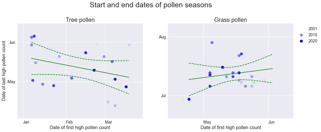
Season duration
There is a clear correlation in the duration of the pollen season (defined as the number of days between the start and end dates as determined above) for both tree and grass pollen, although the correlation is stronger for tree pollen. This gives some predictive power over pollen seasons: a pollen season that starts early does not end early, but will likely persist until the usual end time.
Show code
fig, ax = plt.subplots(1, 2, figsize=(17, 6))
fig.suptitle("Pollen season duration vs. start date", y=1.05, fontsize=25)
years = np.unique(df.index.year)
label_years = [2001, 2010, 2020]
cmap = plt.cm.jet
for i, col in enumerate(['trees', 'grass']):
    period, first = np.zeros((2, len(years)))
    for j, year in enumerate(years):
        series = df[col][df.index.year == year]
        series = series[series.values > 2][:-1]
        period[j] = (series.index[-1] - series.index[0]).days
        first[j] = series.index.dayofyear[0]
        alpha = (year - years[0]) / (years[-1] - years[0])
        label = year if year in label_years else None
        ax[i].plot(first[j], period[j], 'bo', ms=10, markerfacecolor=(0, 0, 1, alpha), markeredgecolor='k', label=label)
    sort_idx = np.argsort(first)
    x, y = first[sort_idx], period[sort_idx]
    yfit, ci_low, ci_upp = linear_fit(x, y)
    ax[i].plot(x, yfit, 'g')
    ax[i].plot(x, ci_low, 'g--')
    ax[i].plot(x, ci_upp, 'g--')
    ax[i].set_title(col_labels[col], size=20)
    ax[i].set_xlabel("Date of first high pollen count", size=16)
    if i == 0:
        ax[i].set_ylabel("Days between first and\nlast high pollen counts", size=16)
    ax[i].tick_params(labelsize=14)
    ax[i].set_xticks(monthstartdays)
    ax[i].set_xticklabels(months, ha='left')
    ax[i].set_xlim(first.min() - 10, first.max() + 10)
    ax[i].grid(True)
    if i == 1:
        ax[i].legend(loc='upper left', bbox_to_anchor=(1, 1), fontsize=14)
# fig.savefig('plots/eug-or-monthly.png')
plt.show()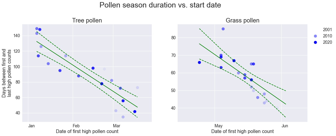
Season severity
We can define the severity of a pollen season as the number of high-pollen days that year; we can see that pollen counts during long pollen seasons (ones that start early) are not spread out across the season, but rather there are simply more high-pollen days. That sucks.
Show code
fig, ax = plt.subplots(1, 2, figsize=(17, 6))
fig.suptitle("Pollen season severity vs. start date", y=1.05, fontsize=25)
years = np.unique(df.index.year)
label_years = [2001, 2010, 2020]
cmap = plt.cm.jet
for i, col in enumerate(['trees', 'grass']):
    highs, first = np.zeros((2, len(years)))
    for j, year in enumerate(years):
        series = df[col][df.index.year == year]
        highs[j] = np.sum(series.values > 2)
        first[j] = series.index.dayofyear[np.argmax(series.values > 2)]
        alpha = (year - years[0]) / (years[-1] - years[0])
        label = year if year in label_years else None
        ax[i].plot(first[j], highs[j], 'bo', ms=10, markerfacecolor=(0, 0, 1, alpha), markeredgecolor='k', label=label)
    sort_idx = np.argsort(first)
    x, y = first[sort_idx], highs[sort_idx]
    yfit, ci_low, ci_upp = linear_fit(x, y)
    ax[i].plot(x, yfit, 'g')
    ax[i].plot(x, ci_low, 'g--')
    ax[i].plot(x, ci_upp, 'g--')
    ax[i].set_title(col_labels[col], size=20)
    ax[i].set_xlabel("Date of first high pollen count", size=16)
    if i == 0:
        ax[i].set_ylabel("Number of high-pollen\ndays that year", size=16)
    ax[i].tick_params(labelsize=14)
    ax[i].set_xticks(monthstartdays)
    ax[i].set_xticklabels(months, ha='left')
    ax[i].set_xlim(first.min() - 10, first.max() + 10)
    ax[i].grid(True)
    if i == 1:
        ax[i].legend(loc='upper left', bbox_to_anchor=(1, 1), fontsize=14)
# fig.savefig('plots/eug-or-monthly.png')
plt.show()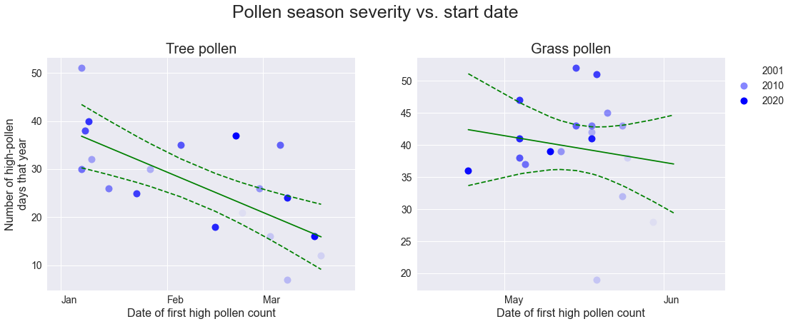
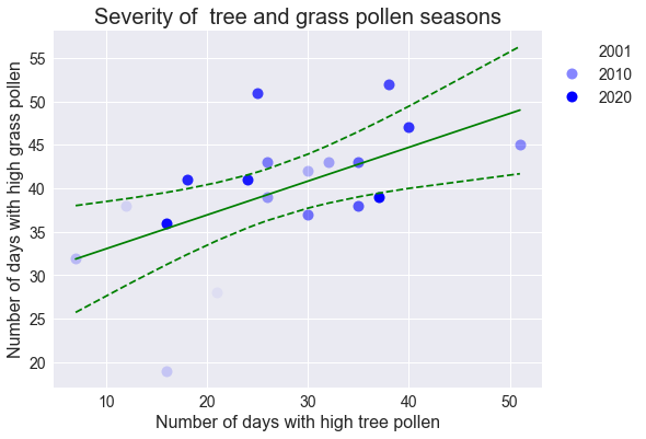
Correlation between pollen types
There may be a slight correlation in the severity of tree and grass pollen seasons, which would provide some predictive power over grass pollen seasons: since severity follows duration and long seasons start earlier in the year, an early tree pollen season not only predicts a long and severe tree pollen season but may also suggest an early, long, and severe grass pollen season.
Show code
fig, ax = plt.subplots(1, 1, figsize=(8, 6))
years = np.unique(df.index.year)
label_years = [2001, 2010, 2020]
cmap = plt.cm.jet
trees, grass = np.zeros((2, len(years)))
for j, year in enumerate(years):
    subset = df[df.index.year == year]
    trees[j] = np.sum(subset['trees'].values > 2)
    grass[j] = np.sum(subset['grass'].values > 2)
    alpha = (year - years[0]) / (years[-1] - years[0])
    label = year if year in label_years else None
    ax.plot(trees[j], grass[j], 'bo', ms=10, markerfacecolor=(0, 0, 1, alpha), markeredgecolor='k', label=label)
sort_idx = np.argsort(trees)
x, y = trees[sort_idx], grass[sort_idx]
yfit, ci_low, ci_upp = linear_fit(x, y)
ax.plot(x, yfit, 'g')
ax.plot(x, ci_low, 'g--')
ax.plot(x, ci_upp, 'g--')
ax.set_title("Severity of  tree and grass pollen seasons", fontsize=20)
ax.set_xlabel("Number of days with high tree pollen", size=16)
ax.set_ylabel("Number of days with high grass pollen", size=16)
ax.tick_params(labelsize=14)
ax.grid(True)
if i == 1:
    ax.legend(loc='upper left', bbox_to_anchor=(1, 1), fontsize=14)
# fig.savefig('plots/eug-or-monthly.png')
plt.show()