Analysis of Heavy Metal Lyrics - Part 4: Network Graphs
Click here for full-size version of the window below. If you’re interested in seeing the full code, check out the original notebook. In the next article we’ll prototype machine learning models for lyric-based genre classification.
Note: Dashboard may take a minute to load
Summary
Network graphs are used to visualize associations between elements of a dataset. In this case, they can be used to show heavy metal bands with similar lyrics or genre tags. This gives us another way to see if there are correlations between lyrical content and genre affiliation.
We can treat bands as nodes in a graph and define edges according to what we’re interested in:
- When visualizing genre association, connect two nodes with an edge if they share a genre tag in common.
- When visualizing lyrical similarity, connect two nodes with an edge if their vocabularies share many words in common. Similiarity can be quantified by cosine similarity between TF-IDF vectors, so we set a minimum cosine similarity for two nodes to be connected.
To distinguish between nodes, we can likewise cluster them by attribute, using K-means clustering. The idea will be to label each node according to a group whose centroid it is nearest to.
- For genre clustering, we create a feature vector for each genre, and perform K-means over this genre space.
- For vocabulary clustering, we create a Tf-Idf vectorization as before.
Dimensionality reduction is required for efficient clustering in both cases, since the parameter space is rather large (a thousand words for lyrical clustering and some tens of genres for genre clustering). Truncated single-value decomposition (SVD) is preferred over principal component analysis (PCA) here due to the sparsity of the feature matrices.
This analysis is applied to the full dataset, but for visualization purposes only the top-350 bands with over 2,500 lyrics are shown in the final product, to preserve consistency with the feature plots dashboard.
Imports
Show code
import os
import numpy as np
import pandas as pd
import matplotlib.pyplot as plt

from nltk.corpus import stopwords

from sklearn.feature_extraction.text import TfidfVectorizer
from sklearn.decomposition import TruncatedSVD, PCA
from sklearn.cluster import KMeans
from sklearn.metrics.pairwise import cosine_similarity
from sklearn.metrics import silhouette_score

import sys
sys.path.append('../scripts/')

import lyrics_utils as utils
Data pre-processing
Show code
def tokenizer(s):
    return [word for word in s.split() if len(word) >= 4]


def clean_words(words, minlen=4):
    stop_words = stopwords.words('english')
    words = [w for w in words if (w not in stop_words) and (len(w) >= minlen)]
    return words
df = utils.load_bands('../bands-1pct.csv')
df = utils.get_band_stats(df)
df_short = utils.get_band_words(df, num_words=2500, num_bands=350)
names_short = df_short['name'].values
names = df['name'].values
df['clean_words'] = df['words'].apply(clean_words)Graph nodes
Vocabulary clustering
The corpus of band lyrics is vectorized using the scikit-learn TfidfVectorizer, reduced with TruncatedSVD, and fit to K-means.
The choice of \(k=5\) clusters is discussed below.
A convenient benefit of K-means is that we usually end up with fairly even clusters.
vectorizer = TfidfVectorizer(
    stop_words=stopwords.words('english'),
    tokenizer=tokenizer,
    min_df=0.01,
    max_df=0.9,
    max_features=1000,
    sublinear_tf=False,
)
corpus = list(df['clean_words'].apply(lambda x: ' '.join(x)))
X = vectorizer.fit_transform(corpus)
vocab_svd = TruncatedSVD(n_components=2, random_state=0)
X_svd = vocab_svd.fit_transform(X)
vocab_kmeans = KMeans(n_clusters=5, random_state=0).fit(X_svd)
vocab_labels = vocab_kmeans.labels_
print("Lyrics clustering results:")
for i in sorted(set(vocab_labels)):
    print(f"{i}: {sum(vocab_labels == i) / len(vocab_labels) * 100:.1f}%")
Lyrics clustering results:
0: 22.4%
1: 19.9%
2: 18.6%
3: 21.1%
4: 18.1%
Show code
plt.figure(figsize=(10, 10))
for i in range(vocab_kmeans.n_clusters):
    cluster_idx = np.where(vocab_labels == i)[0]
    # for more visible plotting, just grab bands in the shortened list, and only the first 30
    cluster_idx = np.array([idx for idx in cluster_idx if df.name[idx] in names_short], dtype=int)
    cluster_idx = cluster_idx[:30]
    # plot x and y values in the reduced parameter space
    x, y = X_svd[cluster_idx].T
    plt.plot(x, y, 'o')
    for j in range(len(cluster_idx)):
        plt.text(x[j], y[j], names[cluster_idx][j])
plt.grid()
plt.show()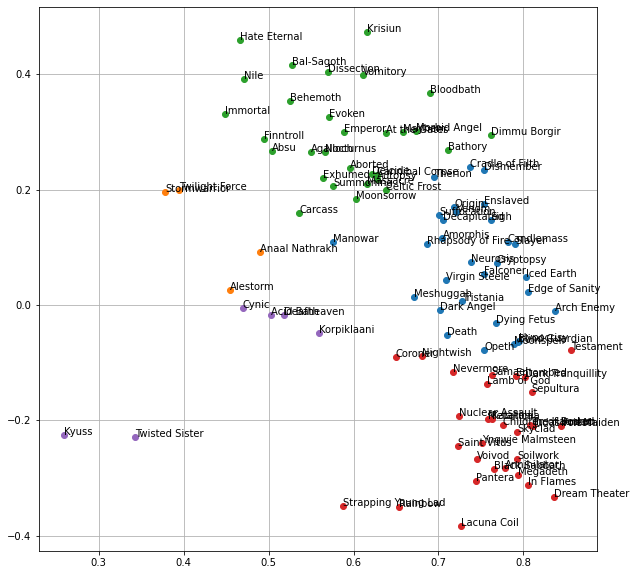
At this point it’s hard to see if this has been effective at all. Thankfully we can use Gephi to better visualize the clustered data, complete with the edges and color-coding. All of the cluster labels and node connections generated in this notebook are exported for processing in Gephi, resulting in the final network graphs.
Choosing ‘k’ for K-means
Deciding on \(k\), the number of clusters, is up to us and can depend on the task at hand. Here I combine two possible ways of choosing \(k\):
- Compute the sum of squared errors (\(SSE\)), which is simply the Euclidean distance between each point and its corresponding cluster center. You can’t simply look for a minimum here, since the higher \(k\) is, the lower WSS becomes. However, you can look for an “elbow” in the curve, beyond which further improvement is small.
- Maximize the silhouette score, which measures how similar each point in a cluster is to each other point in the cluster, compared to its closeness to points in the nearest neighboring cluster. A higher silhouette score is better, but it may not be useful if the maximum score corresponds to a trivially small \(k\), as is the case here.
I combine these two by dividing the silhouette score by the log of \(SSE\), and look for the earliest (smallest \(k\)) local maximum in the metric. Since \(SSE\) drops of roughly exponentially, dividing by \(log(SSE)\) makes more sense than just \(SSE\). This gives a curve that reaches its first local maximum at \(k=5\). Really it’s \(k=2\) but I want to skip that trivial option.
Show code
def test_k_values(points, krange):
    n_k = len(krange)
    sse = np.zeros(n_k)
    sil = np.zeros(n_k)
    lab = np.zeros((n_k, len(points)))
    for i, k in enumerate(krange):
        kmeans = KMeans(n_clusters=k, random_state=0).fit(points)
        labels = kmeans.labels_
        centroids = kmeans.cluster_centers_
        for j, p in enumerate(points):
            center = centroids[labels[j]]
            sse[i] += (p[0] - center[0])**2 + (p[1] - center[1])**2
        sil[i] = silhouette_score(points, labels, metric='euclidean')
        lab[i, :] = labels
    return sse, sil, lab
kmin = 2
kmax = 10
krange = np.arange(kmin, kmax + 1)
sse, sil, lab = test_k_values(X_svd, krange)
fig, (ax1, ax2, ax3) = plt.subplots(3, 1, figsize=(12, 8))
ax1.plot(krange, sse)
ax1.set_xlim(kmin, kmax)
ax1.set_ylim(0, wss.max())
ax1.set_xlabel("k")
ax1.set_ylabel("Within-cluster-sum of\nsquared errors (WSS)")
ax2.plot(krange, sil)
ax2.set_xlim(kmin, kmax)
ax2.set_ylim(0, sil.max())
ax2.set_xlabel("k")
ax2.set_ylabel("Silhouette score")
ax3.plot(krange, sil / np.log(wss))
ax3.set_xlim(kmin, kmax)
ax3.set_xlabel("k")
ax3.set_ylabel("Ratio")
plt.show()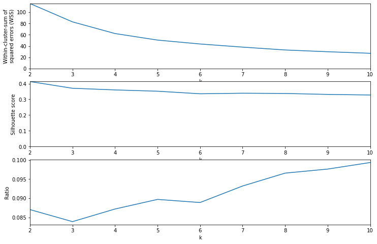
Genre clustering
Similar process for genres, but in this case the genre columns (binary values) are treated as the feature matrix. The value of \(k=6\) is determined in a similar way.
genre_cols = [c for c in df.columns if 'genre_' in c]
Y = df[genre_cols].values
Y_svd = TruncatedSVD(n_components=2, random_state=0).fit_transform(Y)
genre_kmeans = KMeans(n_clusters=6, random_state=0).fit(Y_svd)
genre_labels = genre_kmeans.labels_
print("Genre clustering results:")
for i in sorted(set(genre_labels)):
    print(f"{i}: {sum(genre_labels == i) / len(genre_labels) * 100:.1f}%")
for i in sorted(set(genre_labels)):
    center_genres = sorted(zip(genre_cols, Y[genre_labels == i].mean(axis=0)), key=lambda x: -x[1])
    print(", ".join([f"{genre.split('_')[1]} {value:.2f}" for genre, value in center_genres if value > 0.1]))
Genre clustering results:
0: 21.7%
1: 10.9%
2: 16.9%
3: 5.9%
4: 19.8%
5: 24.8%
thrash 0.39, progressive 0.37, doom 0.29, power 0.15
death 1.00, doom 0.40, thrash 0.39, progressive 0.26
black 1.00
black 1.00, death 1.00, symphonic 0.12
death 1.00
power 0.40, heavy 0.29, symphonic 0.11
Choosing ‘k’ for genre clustering
Show code
kmin = 2
kmax = 10
krange = np.arange(kmin, kmax + 1)
wss, sil, lab = test_k_values(Y_pca, krange)

fig, (ax1, ax2, ax3) = plt.subplots(3, 1, figsize=(12, 8))

ax1.plot(krange, wss)
ax1.set_xlim(kmin, kmax)
ax1.set_ylim(0, wss.max())
ax1.set_xlabel("k")
ax1.set_ylabel("Within-cluster-sum of\nsquared errors (WSS)")

ax2.plot(krange, sil)
ax2.set_xlim(kmin, kmax)
ax2.set_ylim(0, sil.max())
ax2.set_xlabel("k")
ax2.set_ylabel("Silhouette score")

ax3.plot(krange, sil / np.log(wss))
ax3.set_xlim(kmin, kmax)
ax3.set_xlabel("k")
ax3.set_ylabel("Ratio")

plt.show()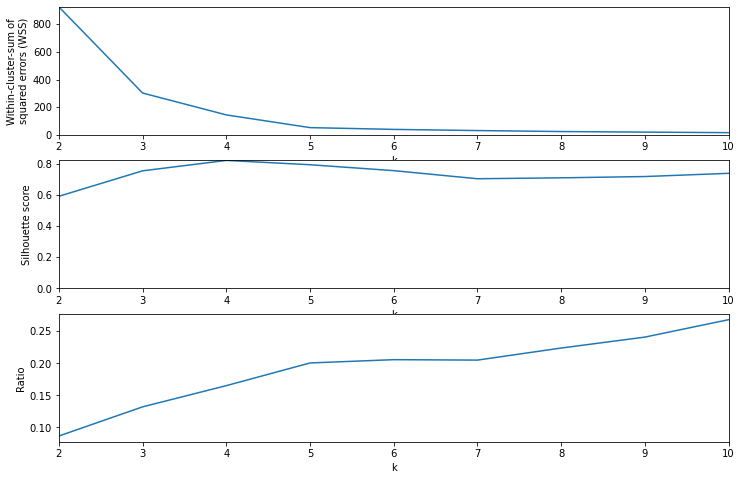
Create labeled nodes
For handling graph nodes, Gephi just needs a table of numerical id values, string label values,
and any number of integer columns representing categories for coloring the graph.
In this case I include the genre and vocabulary clusters as categorical columns.
nodes = pd.DataFrame({'id': range(1, len(names) + 1), 'label': names, 'genre': genre_labels, 'lyrics': vocab_labels})
nodes = nodes[nodes.label.isin(names_short)].reset_index(drop=True)
nodes
| id | label | genre | lyrics | |
|---|---|---|---|---|
| 0 | 1 | Amorphis | 2 | 0 |
| 1 | 2 | Blind Guardian | 3 | 0 |
| 2 | 3 | Iced Earth | 3 | 0 |
| 3 | 4 | Katatonia | 2 | 3 |
| 4 | 5 | Entombed | 2 | 3 |
| ... | ... | ... | ... | ... |
| 195 | 3217 | Whitechapel | 5 | 3 |
| 196 | 3315 | Fleshgod Apocalypse | 2 | 0 |
| 197 | 3328 | Alestorm | 3 | 1 |
| 198 | 3682 | Ghost | 0 | 2 |
| 199 | 3722 | Deafheaven | 5 | 4 |
200 rows × 4 columns
Edges
Vocabulary similary
We can quantify similarity between two bands’ lyrics by measuring the cosine similarity between their respective Tf-Idf vectors. This is a pretty efficient calculation given the large vector space being used. The threshold for drawing an edge between two nodes depends on the cosine similarities of each node to all other nodes. For instance, to determine if nodes \(i\) and \(j\) will be connected, the cosine similiarity between them, \(C_{ij}\), must exceed the mean of \(C_{ik}\) for all \(k \neq i\) plus two standard deviations of \(C_{ik}\). The factor of two standard deviations is chosen to get roughly the same ratio of edges to nodes as I get in the genre similarity method further below.
cos_matrix = cosine_similarity(X)
cos_vals = cos_matrix[cos_matrix < 1]
vocab_edges_dict = {'Source': [], 'Target': []}
for i, name in enumerate(names):
    row = cos_matrix[i, :]
    vals = row[row < 1]
    thresh = vals.mean() + 2 * vals.std()
    idx = np.where(row > thresh)[0]
    idx = idx[idx != i]
    for j in idx:
        vocab_edges_dict['Source'].append(i + 1)
        vocab_edges_dict['Target'].append(j + 1)
vocab_edges = pd.DataFrame(vocab_edges_dict)
vocab_edges = vocab_edges[vocab_edges.Source.isin(nodes.id) & vocab_edges.Target.isin(nodes.id)]
vocab_edges
| Source | Target | |
|---|---|---|
| 0 | 1 | 2 |
| 1 | 1 | 4 |
| 2 | 1 | 19 |
| 3 | 1 | 20 |
| 4 | 1 | 24 |
| ... | ... | ... |
| 297923 | 3722 | 571 |
| 297924 | 3722 | 593 |
| 297943 | 3722 | 1679 |
| 297951 | 3722 | 2225 |
| 297954 | 3722 | 2615 |
5406 rows × 2 columns
num_edges = np.zeros(len(nodes))
for i, row in nodes.iterrows():
targets = vocab_edges.loc[vocab_edges.Source == row.id, 'Target'].values
sources = vocab_edges.loc[vocab_edges.Target == row.id, 'Source'].values
num_edges[i] = len(targets) + len(sources)
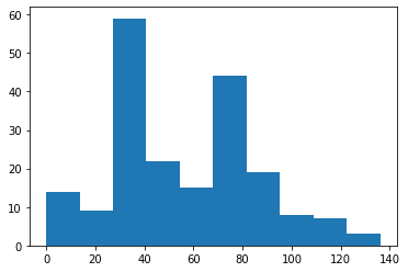
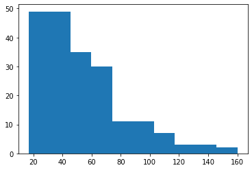
print(num_edges.mean())
plt.hist(num_edges)
plt.show()
54.06
Genre similarity
This is simple: draw an edge between two nodes if they share a genre tag in common.
genre_edges_dict = {'Source': [], 'Target': []}
for i, row1 in nodes.iterrows():
    id_i = row1.id
    for j, row2 in nodes[nodes.id > id_i].iterrows():
        id_j = row2.id
        if np.dot(Y[id_i - 1], Y[id_j - 1]) > 0:
            genre_edges_dict['Source'].append(id_i)
            genre_edges_dict['Target'].append(id_j)
genre_edges = pd.DataFrame(genre_edges_dict)
genre_edges
| Source | Target | |
|---|---|---|
| 0 | 1 | 4 |
| 1 | 1 | 5 |
| 2 | 1 | 6 |
| 3 | 1 | 8 |
| 4 | 1 | 9 |
| ... | ... | ... |
| 5625 | 3024 | 3116 |
| 5626 | 3024 | 3175 |
| 5627 | 3024 | 3217 |
| 5628 | 3024 | 3315 |
| 5629 | 3175 | 3315 |
5630 rows × 2 columns
num_genre_edges = np.zeros(len(nodes))
for i, row in nodes.iterrows():
    targets = genre_edges.loc[genre_edges.Source == row.id, 'Target'].values
    sources = genre_edges.loc[genre_edges.Target == row.id, 'Source'].values
    num_genre_edges[i] = len(targets) + len(sources)

print(num_genre_edges.mean())

plt.hist(num_genre_edges)
plt.show()
56.3